We already saw in a previous post some of the graphics that Cauldron offers on the page of each project. However, these graphs often do not supply all the needs that a user may need.
Therefore, at Cauldron we also offer the possibility of visualizing the data generated by your analysis in Kibana. You have two options: use some dashboards predefined by the Cauldron team or create your own dashboards. Let’s see both options!
Using Cauldron predefined dashboards
Each project in Cauldron has its own dashboard, and to access it you only have to click on the button called Public Dashboard.
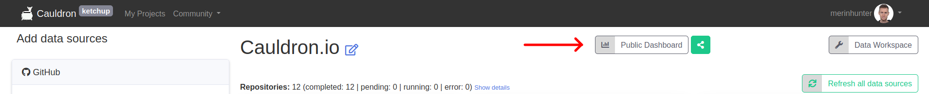
Although you can access the dashboard at any time once the analysis has started, we recommend not doing so until it has been completed completely, as this will give you a more accurate view of your analysis.
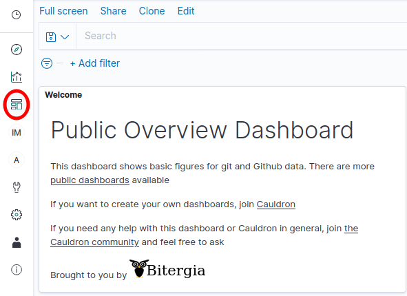
From here, you can see at a glance several of the metrics generated by your analysis, such as activity in the repositories.

In addition to this general dashboard, Cauldron offers a few more specific ones, which you can find by accessing the Dashboard menu.
Using customized dashboards
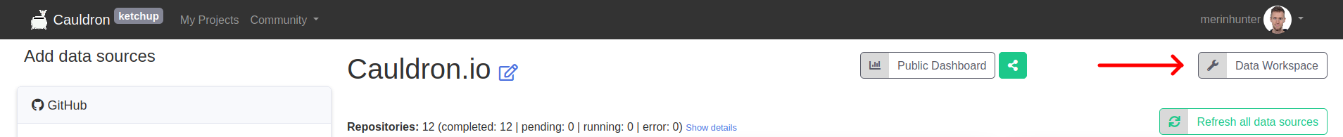
For those more seasoned users in Kibana, or for those who want to go beyond the Public Dashboard, Cauldron offers the possibility of customizing your own panels in Kibana. To do this, the first thing is to access your Data Workspace.
Once inside, you will see some panels with information and links to documentation on how to create new visualizations. And if you access the Visualize and Dashboard menus, you will see practically the same visualizations/dashboards that you saw in the previous section, with the difference that they can now be edited. (The edition of these panels/visualizations will not affect those seen in the Public Dashboard).
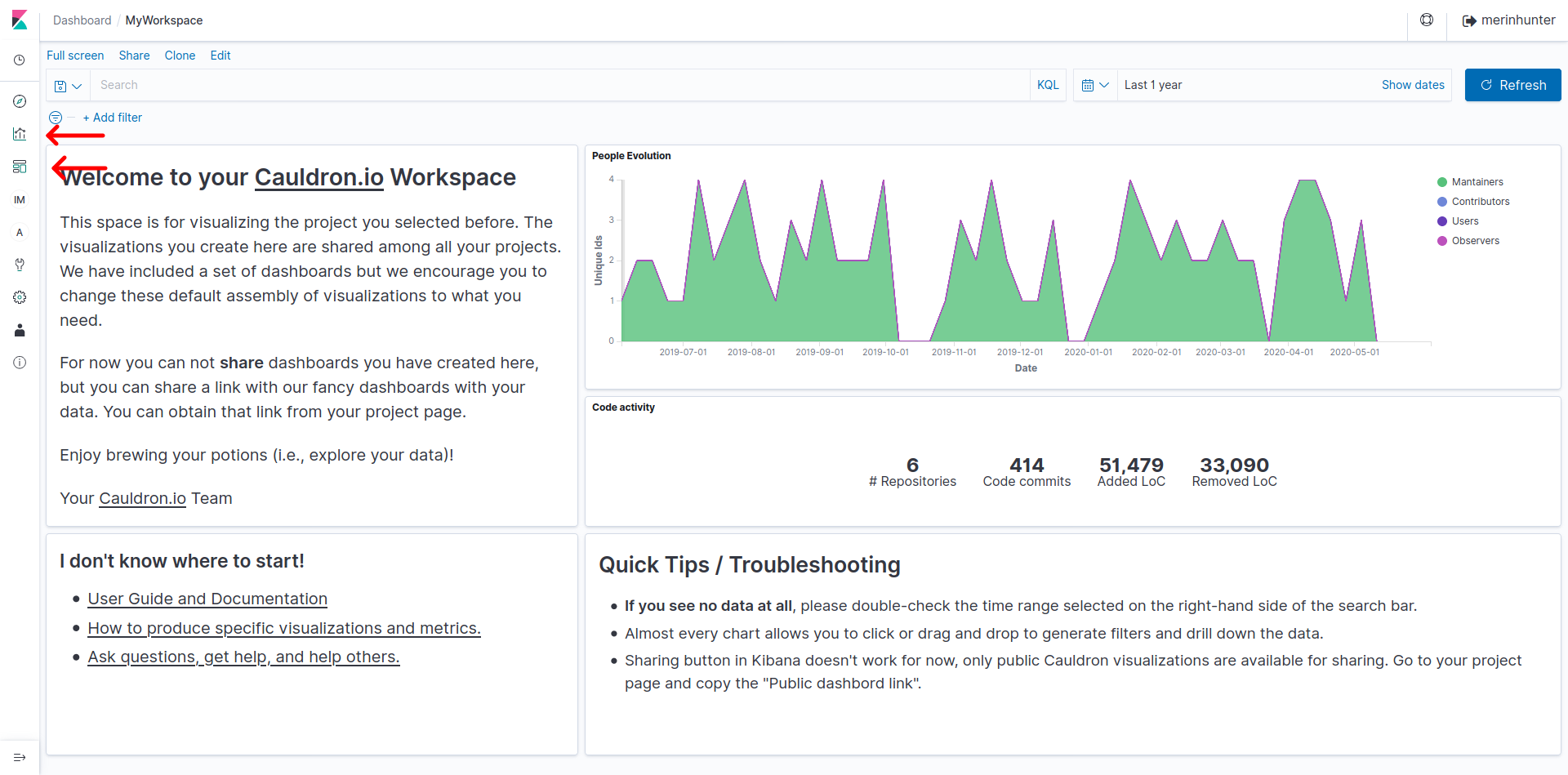
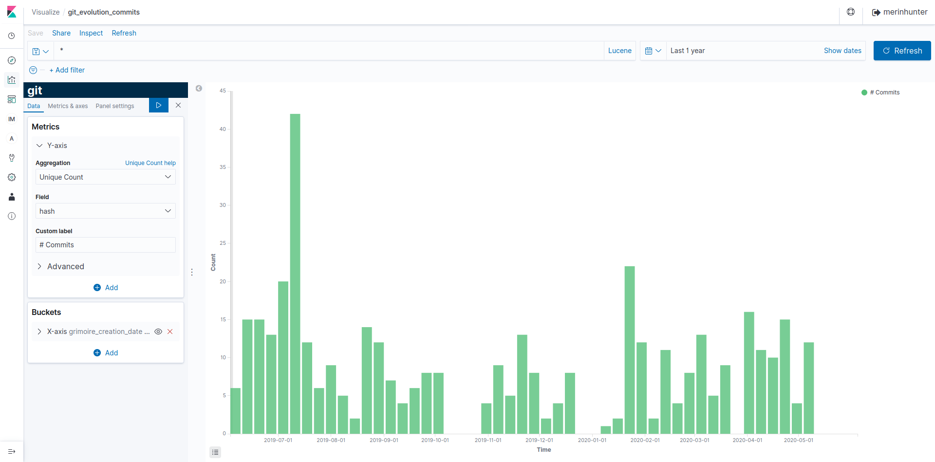
Each visualization makes use of one or more indexes generated by Cauldron (you can see more information about these indexes here), so the edition or creation of new visualizations requires a previous study of this documentation. For example, the visualization called git_evolution_commits makes use of the index named git, using the fields in this index specifically to display the information we want.
There are many types of visualizations, and in Cauldron we have some posts talking about it, or you can also take a look at the Kibana documentation to go deeper.
Cauldron.io Team