In this short post we want to introduce some changes that we have been making to the Overview section, within the metrics page of a project.
The first and most striking thing that you will see when you enter will be the new descriptions that we have included next to each of the visualizations. This little added text tries to give a brief introduction about the visualization it accompanies, so that users have a little more context about what they are seeing. It also includes a link to a more extensive description of the visualization, as well as some technical details.
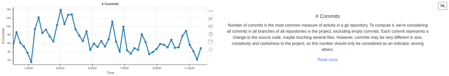
We know that these descriptions are somewhat large, and that after having read them for the first time they may no longer add as much value to the page. That is why we have included a button next to the time filter to hide these descriptions, as well as to show them again if we want. This same button can be found next to each of the descriptions.
![]()
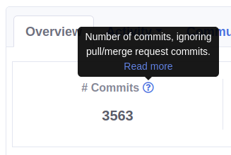
Last but not least, we have replaced the links in the metrics found on this page with tooltips with a short description of the metric, and a link to more detailed documentation for it.
As you can see, these changes give a review to the overview section, and our idea is to extend this model to the rest of the sections, if it is successful.
We look forward to your comments, see you soon!
Cauldron.io Team